1. Quick Start
Prepare USB Stick
Create an AutoPlayFile folder and copy your images, videos, and logo into it.
Plug In & Go
Insert the USB stick into your Android device. KioskPilot detects it automatically and copies the content.
Enjoy Your Display
Your slideshow and videos start playing automatically with smooth crossfade transitions.
2. USB Stick Setup
KioskPilot reads all its content from a single folder on your USB stick. The folder must be named AutoPlayFile and placed at the root of the USB drive.
Folder Structure
USB Drive (root)
└── AutoPlayFile/
    ├── config.txt              ← Configuration (optional)
    ├── logo_banner.png         ← Logo (any file starting with "logo")
    ├── logo_secondary.jpg      ← Second logo (auto-rotates)
    ├── photo1.jpg              ← Images for slideshow
    ├── photo2.png
    ├── brochure.webp
    ├── product_video.mp4       ← Videos for loop
└── demo.movlogo (e.g., logo.png, logo_banner.jpg). If you have multiple logos, they rotate automatically with a crossfade effect.
logo are treated as slideshow images. They are sorted alphabetically and displayed with crossfade transitions.
3. Supported Media Formats
Images
.jpg .jpeg .png .gif .webp .bmp .pdf
PDF files are rendered as images (first page). They work in slideshows and storyboard scenes just like regular images.
Videos
.mp4 .webm .mkv .avi .mov
For best results, encode videos at 1080px width using H.264 (MP4).
4. Configuration File (config.txt)
You can configure KioskPilot by placing a config.txt file inside the AutoPlayFile folder on your USB stick. This is optional — you can also configure everything through the on-device Settings screen.
Example config.txt
# KioskPilot Configuration
# Lines starting with # are comments.
# All durations are in seconds.
# Use \n for line breaks in footer text.

slideshow_duration=15
logo_duration=10
footer_duration=10
mute=true
kiosk_mode=false

layout_mode=split
video_position=bottom
split_ratio=0.5
screen_orientation=portrait
screen_padding=20

background_color=#000000
logo_bar_color=#FFFFFF
footer_bar_color=#FFFFFF
footer_text_color=#1B3A5C
footer_font=sans-serif-medium
footer_font_size=22

footer_text=Staubfreies Heu und Stroh\nfür gesunde und leistungsstarke Pferde.
footer_text_2=Qualität seit über 30 Jahren.
Complete Reference
Timing
| Key | Default | Description |
|---|---|---|
slideshow_duration |
15 | Seconds each image is shown (5–60) |
logo_duration |
10 | Seconds per logo when rotating multiple logos (3–60) |
footer_duration |
10 | Seconds per footer text when rotating multiple texts (3–60) |
mute |
true | Mute video audio on start (true / false) |
kiosk_mode |
false | Lock the app in the foreground using screen pinning (true / false) |
Layout
| Key | Default | Description |
|---|---|---|
layout_mode |
auto | auto, split, images_only, or videos_only |
video_position |
bottom | In split mode: top or bottom |
split_ratio |
0.5 | Image/video size ratio (0.1–0.9). E.g., 0.7 = 70% images, 30% video |
screen_orientation |
auto | auto, portrait, or landscape |
screen_padding |
0 | Border padding around content in pixels (0–200) |
Appearance
| Key | Default | Description |
|---|---|---|
background_color |
#000000 | Screen background color (hex) |
logo_bar_color |
#FFFFFF | Logo area background color (hex) |
footer_bar_color |
#FFFFFF | Footer area background color (hex) |
footer_text_color |
#1B3A5C | Footer text color (hex) |
footer_font |
sans-serif-medium | Footer font family (Android system fonts) |
footer_font_size |
22 | Footer text size in sp |
Footer Text
| Key | Description |
|---|---|
footer_text |
Primary footer text. Use \n for line breaks. |
footer_text_2 |
Second footer text (auto-rotates with primary). |
footer_text_N |
Any key starting with footer_text is collected and cycled. |
If you define multiple footer texts, they rotate automatically with a crossfade transition at the interval set by footer_duration.
5. On-Device Settings
You can configure all settings directly on the device through the Settings screen. Tap anywhere on the display to show the control bar, then tap the gear icon to open Settings.
Settings configured on the device are also saved back to config.txt, so they persist across USB updates. If a config.txt exists on the USB stick, it is imported automatically on first launch.
Kiosk Settings
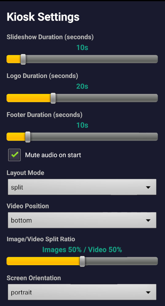
Shows your current license status. The free version supports up to 3 images and 1 video with a watermark. Pro unlocks unlimited content and full appearance customization.
How long each image is displayed (5–60 seconds). Drag the slider to adjust.
How long each logo is shown before rotating to the next (3–60 seconds). Only relevant when you have multiple logo files.
How long each footer text is shown before rotating (3–60 seconds). Only relevant with multiple footer texts.
When checked, video audio is muted when the app starts. You can toggle audio from the control bar at any time.
auto (adapts to content), split (images + video), images_only, or videos_only.
In split mode, choose whether video appears at the top or bottom of the screen.
Drag to control how much screen space goes to images vs. video. 50/50 is the default.
auto, portrait, or landscape. Locks the display to your chosen orientation.
6. Appearance & Branding
Scroll down in the Settings screen to find the Appearance section, where you can fully customize colors, fonts, and footer text to match your brand.
Colors & Padding
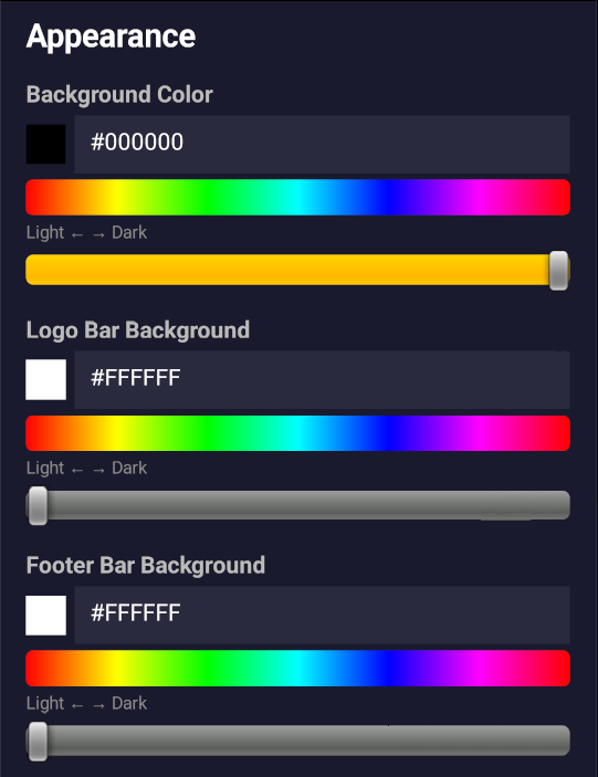
Background Color: The main screen background behind your content.
Logo Bar Background: The background color of the logo area at the top of the screen.
Footer Bar Background: The background color of the footer text area at the bottom.
Footer Text Color: The color of your footer text.
Screen Padding: Adds a border around your content (0–200 px). Your screen dimensions are shown for reference.
Tap any color swatch to enter a hex code directly.
Footer Text & Font
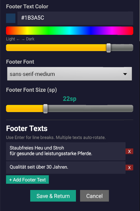
Footer Text Color: The color of your footer text.
Footer Font: Choose from available Android system fonts.
Footer Font Size: Adjust the text size (in sp).
Footer Texts: Add, edit, or remove footer text entries. Multiple entries auto-rotate. Use Enter for line breaks within a single entry. Tap + Add Footer Text to add more.
Tap Save & Return to apply your changes. Settings are saved to both the device and config.txt.
7. Layout Modes
Auto
Automatically adapts based on your content. If you have both images and videos, it uses split view. If only images or only videos, it fills the full screen.
Split
Displays images and videos simultaneously on screen, split by the configured ratio. Choose whether video goes on top or bottom.
Images Only
Full-screen image slideshow. Videos are ignored even if present on the USB stick.
Videos Only
Full-screen video loop. Images are ignored even if present on the USB stick.
8. On-Screen Controls
Tap anywhere on the screen to reveal the control bar. It auto-hides after 5 seconds of inactivity.
Opens the full Settings screen.
Exits the kiosk app.
Decrease or increase slideshow duration by 5 seconds. The current duration is shown in the center.
Toggle video audio on or off.
Manually trigger a content reload from USB.
9. Updating Content
To update the content on your display:
- Update the files in the
AutoPlayFilefolder on your USB stick. - Insert the USB stick into the Android device.
- The app automatically detects the USB and copies the new content.
- If the USB was already inserted, tap the screen to show the control bar, then tap UPD to reload.
Note: The USB copy replaces all content in the app's internal storage. If you remove a file from the USB, it will also be removed from the display after the next update.
10. Kiosk Mode (Lock Screen)
For trade shows and public displays, you can lock the device so that users cannot exit the app or access other apps.
Option 1: Screen Pinning (config.txt)
Add this line to your config.txt:
kiosk_mode=trueThis uses Android's screen pinning to lock the app in the foreground. The Home and Recent buttons are disabled. To exit kiosk mode, tap the screen to show the control bar and press the Q (Quit) button.
Option 2: Home Activity Override (ADB)
For a deeper lock, you can set KioskPilot as the device's home app via ADB:
Enable:
adb shell cmd package set-home-activity com.kioskpilot.app/.MainActivityDisable (restore normal launcher):
adb shell cmd package set-home-activity com.android.launcher3/.LauncherThe app also starts automatically when the device boots, so after a power cycle it goes straight into display mode.
11. Storyboard (Scene-Based Playback)
For advanced presentations, KioskPilot supports a storyboard that lets you define a sequence of scenes, each with its own video, images, layout, timing, and appearance. This is perfect for trade show presentations, product demos, or any display that needs structured multi-scene playback.
How It Works
Place a storyboard.txt file in your AutoPlayFile folder alongside your media files. When KioskPilot detects this file, it switches from simple slideshow mode to scene-based playback.
Each scene can have its own video, images, layout, transitions, and footer text. Scenes play in order and loop back to the first scene when the last one ends.
Basic Example
# storyboard.txt - Each [scene] block defines a scene

[scene]
video = product_demo.mp4
images = slide1.jpg 10s, slide2.jpg 15s, slide3.jpg rest
layout = split
position = video-bottom
header = yes
footer = yes
footer_text = Welcome to our booth!
transition = fade

[scene]
video = behind_the_scenes.mov
layout = full
header = no
footer = no
transition = cut

[scene]
images = brochure.pdf 15s, thank_you.jpg 10s
layout = full
footer = yes
footer_text = Thank you for visiting!
Scene Types
Video + Images
Video loops continuously while images cycle through with their own durations. The scene advances when all images have been shown. Great for split-screen presentations.
Video Only
Plays a video fullscreen. The scene advances when the video ends. Perfect for product demos or promotional clips.
Images Only
Displays images (including PDFs) as a timed slideshow. Scene duration is the sum of all image durations. Ideal for brochures and static content.
Scene Settings Reference
Media
| Key | Description |
|---|---|
video |
Video filename (e.g., video = demo.mp4) |
image |
Single image filename (e.g., image = photo.jpg) |
images |
Comma-separated image list with durations: images = a.jpg 10s, b.png 15s, c.pdf rest |
Image Duration Syntax
| Format | Example | Description |
|---|---|---|
| Seconds | 10s |
Display for 10 seconds |
| Milliseconds | 500ms |
Display for 500 milliseconds |
| Rest | rest |
Fill remaining video time (only in video+images scenes) |
| Omitted | — | Uses your slideshow duration setting |
The rest keyword is useful when you want an image to fill the remaining time of a looping video. For example, with a 30s video and slide1.jpg 10s, slide2.jpg rest, the second image shows for 20 seconds.
Layout & Appearance
| Key | Default | Description |
|---|---|---|
layout |
split | split (images + video side by side) or full (fullscreen) |
position |
video-bottom | video-top or video-bottom (split layout only) |
split_ratio |
0.5 | Image/video size ratio (0.1–0.9) |
header |
yes | Show logo header: yes or no |
footer |
yes | Show footer text area: yes or no |
footer_text |
— | Custom footer text for this scene (overrides global). Use \n for line breaks. |
background_color |
— | Custom background color for this scene (hex, e.g., #1B3A5C) |
padding |
— | Custom padding for this scene (0–200 px) |
transition |
fade | fade (smooth crossfade) or cut (instant switch) |
duration |
— | Total scene duration for image-only scenes (e.g., 15s) |
Scene Navigation
When a storyboard is active, the control bar shows additional navigation buttons:
Jump to previous/next scene
Previous/next image within the current scene
Scenes play automatically in sequence. After the last scene, playback loops back to the first scene.
Note: If the storyboard.txt file contains errors or no valid scenes, KioskPilot falls back to its normal slideshow mode. The storyboard file persists on the device and is not deleted when you remove the USB stick.
12. Tips & Troubleshooting
Video Performance
For smooth playback, encode videos at 1080px width. Large 4K files waste storage and may stutter on lower-end devices. Use H.264 (MP4) for maximum compatibility.
Logo Not Showing?
Make sure the filename starts with logo (e.g., logo.png, logo_banner.jpg). Files that don't start with "logo" are treated as slideshow images.
USB Not Detected?
The USB stick must have a folder named exactly AutoPlayFile at the root level. Check spelling and capitalization. Try unplugging and re-inserting the stick.
Footer Text Not Appearing?
Make sure footer_text=... is defined in your config.txt, or add footer texts through the Settings screen. After updating config.txt on the USB, tap UPD to reload.
Need Help?
Contact us at support@kioskpilot.com and we'll help you get set up.